Showing posts with label Grading. Show all posts

Wednesday, July 31, 2013

Cinematic CC/Grading in Adobe Photoshop

One day I was wondering how they probably grade in movies to make it look different, because no matter what you do with your photo the touch of the movies always seems different.
Then I remembered back when I was something like 10 or 12 years old, I saw some behind the scenes stuff of a TV series. At the time I didn't really think about it but I noticed that the image looks pretty flat and kinda boring, first I thought well this sucks why do they make their image so flat and boring, but then it came to me, I started looking at my movies very carefully and noticed, even though they seem to have a nice contrasty picture they retain almost all the detail in the dark areas and the detail in the highlights.
So how do they do this or how are we going to do this? Well by making only the darkest pixels truly black. That way we will retain the detail but still make it look like there is a lot of contrast in it.
A side note, shoot in RAW, this might work with jpeg but I wouldn't count on it and for this we especially need to torture the picture quite a bit.

This is what the picture looks like with the usual or modern corrections, and with the cinematic style.


I also should mention that I also used cross processed the Cine version of this picture to add some extra color and make it little more dramatic.

But I will go over that too.


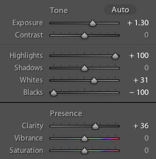
Well let's get started, once you have your RAW image open it up in Camera raw in Photoshop. Your goal here is to make the Picture as flat as possible. So turn down the Highlights, turn up the blacks, also move the shadow slider to the right and pull down on the whites and contrast also. In this case it looked something like this.

As you can see it's very very flat and you can see almost every detail in the foreground. We are finished in camera raw so go ahead and open it up in PS. 
First make a duplicate of your background layer as a backup, then switch to the 16 bit mode and apply shadows and highlights to the picture to make it even more flat, this may seem like a bad idea but you'll see why I do this. 


I usually don't mess with the highlights but set the shadows to bring back some more detail. And yea btw the 16 bit mode helps you to retain quality while torturing your picture a little more. 

The next step is optional but I did use it to get some more color in the image, I usually if I decide to do this I do it first, adding the color that is. 
You can either use gradients or like I do use a brush both works fine. So I select the color I want, in this case a light orange, make a medium sized brush so it covers a quarter of the image, turn the opacity down to like 80%, set the Hardness to 0% and paint it on a new layer. Then I scale it way up to match the it where I want it, don't be afraid to move the circle out a little, the outer edges of the brush is way softer so I might scale the layer up to a huge size and then use only the outer edge of the color I painted in. 

This might give you a better idea what I am talking about.

First, since I know adding the contrast back with curves later on gives me a lot of over saturated color and such, so I create a black and white adjustment layer and turn the opacity down 40-60%, duplicate it and set the duplicate to multiply to get a darker image or soft light for a lighter image if you work in a dark environment anyways.

After that I add curves, I can't give you a exact number here but I can show you what I did to achieve my picture.


I not only messed with the RGB curve but also with the Red and Blue curve to add the color in the highlights and shadow that I choose. In general it's a good idea to make a nice S curve in the RGB panel. Depending on the picture I might add another curves adjustment layer just to make sure I get the lighting I want, in this case I pulled up the Highlights a little bit to make it seem like a bright day.


And this is what it looks like so far and in this case finished, I was happy with this picture as it was at this point.
But you can do more, you might wanna add some vignetting and maybe some noise.

First off the noise, create a new layer below the last adjustment layer in this case Black and white on multiply, then it Shift+F5 to fill the new layer with 50% grey.

Then go to the Filter tap and Add Noise, choose Uniform then hit okay. I only use monochromatic noise but that's personal preference.


I scale it up a bit to make it look more like a film in which the noise is very random.


Then just put it to soft light and adjust the opacity accordingly.

For vignetting you repeat the process with the 50% grey layer, but this time you put it right above the background and make it white. Go to the Lens Correction tool and then go to the custom tab on the right side of the window and adjust you vignette.

Adjust the settings however you see fit then click apply then set it to soft light adjust the opacity, make a duplicate of the layer and set the duplicated layer to multiply and adjust the opacity aswell.

And that's usually it, I will note here that the vignetting I didn't figure out myself, I caught it on youtube somewhere, this guy did also Cinematic grading.

If you want to go even further by selectively adjustung highlights etc then check this guy out:
http://www.youtube.com/watch?v=8bpel1NdW50

He does the rest of the Grading almost exactly I do it so if you prefer narrated video then check him out he is really good.

Also if you're not sold on the whole Cine Grade thing and say "Well it's not that good" check out my other pictures many of them are graded with this technique maybe you'll find one of your liking.

My Flickr

Take Care

Sunday, July 14, 2013

Lightroom Split Toning

What is Split Toning? Split toning is a process in which you change the color of Highlights and Shadows individually. In simple terms you can change the dark parts of your picture to a bluish tint and the bright parts to an orange tint.


Split Toning in Lightroom is very simple you can either pick a color from the color picker (which is a color scale) or use the hue slider to find a color. Then you simple adjust the Saturation to choose the intensity of the picked out color. Balance is used to adjust which color is shown better either the highlight colors or the shadow colors. 


In this case I took the vibrance in the split toned picture all the way down, in every other way those to pictures are the same. Lightroom makes split toning incredibly easy. 

Take Care

Capturing the Stars

Ever wondered how photographers get the Milky Way to pop out like that? Well I wondered the same thing a while ago and I've figured it out (so far at least) and I'm listing the stuff you need and what you need to do.

- Good weather conditions like low humidity, no clouds and so on and so fourth.
- A suitable season, for the northern hemisphere it's Spring or Summer (the Milky Way is further up)
- And what I learned the hard way recently is just a good location, low light pollution and it's very useful if the countryside is very flat. Now on the subject of light pollution we in Europe have a real issue. Europe is so densely populated that you have light pollution almost everywhere, the really really good stuff you can't get around here, even the best equipment can bypass that main problem.
But you still should be able to get a decent picture if you work around as best as you can.
- Timing is key, you need to know where the Milky Way is in your timeframe, a good way to determine the location of the Milky Way is to use the Program called Stellarium, if you turn down the light pollution level you can see the Milky Way very clearly and you can use the clock to set a good time (don't forget to set your location).
- Use Google Maps to mark a good position and drive there in advance.

Now the equipment:
If you got everything up there you also need equipment.

- You'll need your camera obviously, it doesn't need to be a full frame although that helps a lot with the noise levels
- A tripod, there's no other way to hold your camera steady.
- A fast lens, meaning a lens with a very wide aperture. F3.5 works but it would be better if you had one with 2.8 or even 1.8. Also your focal length shouldn't be above 24mm (at most) otherwise you have to dial down the shutter speed (I'll explain that some other time, or just google) or you will get star trails very quickly.
- Keep your ISO levels beneath 3200, if you crank it up to something like 6400 it will look like you see a lot more stars but in reality that's just noise.
-Expose 20 to 30 seconds.

Another important thing for the poor suckers like me who live in Europe even if you have a very fast prime lens with a good focal length, and full frame camera, you won't be able to get the Milky Way in the full sharpness other photographers do who are based in say, North America.
The Light pollution is just to intense you could use f1.4 24mm and exposure for 25-30 seconds, but the sky will be almost like blown out. I tried it.


Here the Milky Way fades away in the light pollution and it's very hard to bring it back and maintain a clean image.

Now let's talk processing. 
There are couple of ways to process Astro pictures, for now I'm just going to show you two of them in Lightroom, I'll get into the Photoshop method some other time (retaining foreground detail) 

The first way is very simple and it's just meant to bring out as many stars as you can, but you'll lose all the foreground detail and it will just be a silhouette. But first things first, something we do no matter what is White Balance and Tint. I usually set the WB from 3400 to 4000 Kelvin and adjust the Tint accordingly. 


First bring the exposure up to +1.00 to +1.40, then pull the Highlights Slider all the way up and pull the Blacks all the way down, this gives you a super intense contrast between the dark patches of sky and the bright milky way. (Note: Since the foreground is usually very dark it's going to be completely dark from this point on) If you want to add even more contrast, increase the whites just a bit. 
I usually leave the contrast alone, because you start losing the tip of the milky way. Don't use too much clarity or else you will get a lot of noise but a little is just fine you can get a lot of detail.
The Saturation and Vibrance is a purely personal choice I usually you more split toning so I don't really use those sliders. 


For additional contrast adjust the Tone Curve, I can't give you a number here it really just depends on the Image.

Lastly, noise reduction this is really important since you added a bunch of noise on top of the already noisy image by pushing the raw file to it's limits (Oh yea I almost forgot ALWAYS SHOOT IN RAW)
Leave the detail to around 50 and push the Luminance between 30 and 50, if you go further the image starts to get really soft. At first you will think you start to lose some of the stars and you're leaning towards not using noise reduction at all, believe me that's not true I thought that for a long time but really the "Stars" you lose aren't really stars they're just noise in the dark areas of space.


That's the final image I achieved with this processing technique. 

The next one is a little less noise intense and you maintain more detail in the foreground and the surroundings. 
Again start by adjusting the WB (same as before) then adjust your exposure just a little bit if it's off, but try to stay away from that adjust, adjust the contrast and add something between 30+ and 45+. Leave the Highlights, blacks etc alone, you can adjust that later in Tone Curve. Adjust the clarity to somewhere in the twenties, not too much or again you will get a lot of noise and it will just look awful, add Vibrance and Saturation as you wish, but I wouldn't go to high or to low. 


The Tone Curve adjustment. Add Highlights and lights, pull down the darks and pull the shadows up, this again depends on the image. But this will give you more contrast and make the stars pop more.


Noise reduction same as before, although with this processing technique it's not mandatory since you didn't gather as much noise as before.
You can add a bit of sharpening but go easy or you will get more noise.

I hope this gives you a good starting point, those to techniques can also be mixed or you just use a less intense or more intense version of each, this is entirely up to you and what your image needs.

Take Care